Posts

Showing posts from March, 2021

Assesment Feedback + LR

Image
WWW: You’ve written some well-developed, detailed answers here exploring the questions in some depth. This will be a fantastic skill in a real exam or assessment. You make specific reference to the CSPs which is important in exams and assessments and I like the details you have picked out (e.g. about female celebrities in the Reveal answer). EBI: For Q1, you need to answer the question – what is a convention? It is a typical feature. Your magazine cover example is perfect. For Q3, be careful with typos! You initially write ‘Tatler’ when the question is on Reveal. The other feedback for your Reveal answer is to focus more on how Reveal subverts some stereotypes of female celebrities – they are usually presented as perfect in terms of hair, make-up, costume etc. (a little like the image of Lauren in the top right of the cover). The use of paparazzi images subverts this with female celebrities presented in a more ‘real’ way, looking like ordinary women. This subverts stereotypes of celebr

Galaxy AD w/ Audrey Hepburn

Image
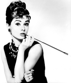
 1) Why is the advert set in the 1950s? What audience pleasure does this provide?  Galaxy done that because it gives the audience a nice nostalgic feeling while watching the advert. 2) Which of Propp's character types are represented in the advert? (Note: just choose two or three character types that are definitely used in the advert - it does not use them all).  The princess character is Audrey Hepburn the hero is the man who offers her the ride and the donor is the bus driver who gives her his hat. 3) How does the advert's narrative (story) follow Todorov's theory of equilibrium? Firstly the equilibrium is Audrey sitting in the bus and the disequilibrium is the bus crashing into he market stall and then the new equilibrium is her riding in the car with the chauffeur 4) Who is Audrey Hepburn? She is a very famous movie actress from the 1950s shes know as a fashion icon and for her great movies. 5) Why did Galaxy select Audrey Hepburn for this advert?  Because Audrey Hepbur

Represent NHS Advert

Image
 1) What does BAME stand for? Black and minority ethnic 2) Why is there a need for blood in the BAME community?  Because only 3% of black and minority ethnic people donate blood and the NHS needs more for patients. 3) What does this advert want people to do once they've seen it (the 'call to action')? It wants people from the BAME community to donate blood as a gift for patients. 4) Why is the advert called 'Represent'? So the people who donate can represent their community. 5) Why have the producers chosen famous BAME celebrities to feature in the advert? Give an example of three well-known people who appear in the advert and why they are famous - make sure you write their names and spell them accurately. First there is Lady Leshurr who is the rapper in the video, We also have Kanya King who is the founder and CEO of MOBO and we also have Nicola Adams the olympic gold medal boxer you see subverting stereotypes in the video. 6) What are the connotations of the slow-

Reveal CSP

Image
  1) How many of the 12 magazine cover key conventions feature on this edition of Reveal? List them with specific reference to the convention on the CSP edition of Reveal. I see a colour scheme of pink,  yellow and red. The direct address is the EXCLUSIVE: one simple trick for your best skin ever. And the price in the top corner. 2) What is the font choice used on the cover and what does this choice connote? Here's a blog to help you with this as we haven't been able to complete the Photoshop typography lesson yet due to Covid-19. They use the Sans-serif which connotes a modern feel to the magazine. 3) How do the cover lines appeal to the Reveal target audience?     It is appealing to the audience because they use an informal way of typing on the magazine. 4) What are the connotations of the Reveal colour scheme on this particular front cover? Pink links with a feminine side, Yellow connotes the sun and is a bright colour, Red connotes love or hatred. 5) How are images used to

OMO advert

Image
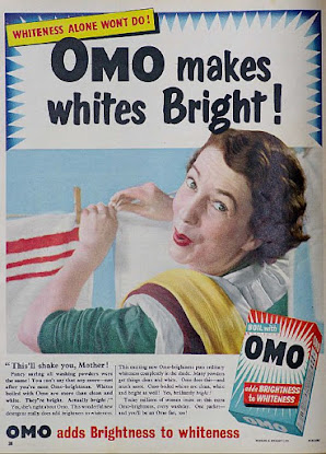
1) What year was the advert produced? 1955 2) How were women represented in most adverts in the 1950s? As the stereotyped housewife like they are meant to be in the kitchen and cleaning. 3) How does the heading message ('OMO makes whites bright') and typography promote the product? The font is in bold which allows the phrase to stand out 4) Analyse the mise-en-scene in the advert (CLAMPS): how is costume, make-up and placement of the model used to suggest women's role in society? The woman is wearing very heavy makeup and a very bold colour of red on her lips, she is hanging clothes which is unusual because usually you do not need to wear heavy makeup just to hang clothes in your own home. 5) Why is a picture of the product added to the bottom right of the advert? So that the audience can recognise the product int he stores and that if they wanted to buy the product they know what it looks like. 6) What are the connotations of the chosen colours in this advert - red, white

Gender representation in advertising

Image
 1) Find three adverts featuring women that are from the 1950s or 1960s. Save the images to your Media folder as jpegs and then import them into your blog post. Hint: You may wish to look at car, perfume or cleaning products but can use any product you wish. Parfume advert 1950 Tide advert 1950 Fridge advert 1950 2) Find three adverts featuring women that are from post-2000. Save the images to your Media folder as jpegs and then import them into your blog post. Fashion advert 2000 Tom Ford advert 2000s Beer advert 2000s 3) What stereotypes of women can you find in the 1950s and 1960s adverts? Give specific examples.  In the adverts from 1950s mostly you see women and housewives using the products and being stereotyped as only women use cleaning products and in the parfume ad the man has his hand around his wife holding a cigarette while she eyes the parfume bottle, shes wearing a lot of makeup and lots of jewelery. 4) What stereotypes of women can you find in the post-2000s adverts? Gi

Advertising: Key conventions

Image
  1) What key conventions of print adverts can you find and what are the connotations or deeper meanings of each convention? I see a product image of the skittles they are trying to sell, i also see the Skittles logo on the packaging and the slogan at the bottom which clearly says ''Taste the rainbow''. 2) For each convention, write about how it might appeal to a target audience.  The product image may appeal to the audience as it shows what they get if they buy the skittles and allows them to recognise the product easily. The colour scheme is rainbow which appeals to the audience because they are using very bright and bold colours. 3) What is the USP (unique selling point) for Skittles and how do you know? The unique selling point in my opinion is the colours skittles use because its unique and not a lot of other sweet companies use such a variety of colours.

Final Index

Image
   Magazines: Introduction and conventions  Magazines: Representation and social contexts  Magazines: Tatler CSP case study Magazines: Reveal CSP case study   Magazines: Exam question blog assessment